“Learn More” is often treated as the safest button label on a law firm website. It isn't. It's frequently the digital equivalent of handing a prospective client a brochure and walking away.
A button is an intake decision point. It tells a visitor what happens next, how much effort is required, and whether the firm understands what the visitor came to do. On a practice area page, every vague label adds friction at the moment someone is deciding whether to call, submit a form, or leave. The lost matter rarely sends a complaint. It simply goes somewhere else.
Law firm owners should judge learn more buttons by the same standard they apply to intake staff: Do they move the right prospect toward a qualified conversation? If the answer is unclear, the button needs work.
Table of Contents
- Why Learn More Buttons Deserve More Thought
- When to Use Learn More and When to Replace It
- Placement That Matches How Prospects Actually Read
- Copy Variations That Beat the Default
- A Simple A/B Test You Can Run This Quarter
- Accessibility and UX Issues Most Firms Miss
- Turning Button Clicks Into Signed Cases
Why Learn More Buttons Deserve More Thought
Buttons became recognizable interface controls during the early web and graphical-user-interface era. Adobe's history of button evolution in UX design describes early 1990s websites and interfaces such as Windows 3.11 and Windows 95 using GIF graphics and three-dimensional styling to signal clickability. Over time, decorative controls became standardized interactive elements. Users learned that a button means, “Take the next step.”
That history explains why “Learn More” feels harmless. It looks familiar, fits almost anywhere, and rarely causes an internal marketing argument. The problem is that familiarity isn't the same as clarity. A visitor doesn't want to learn more in the abstract. They want to understand whether the firm handles their matter, see relevant experience, speak with someone, or get an answer to a specific concern.
Marketing Sherpa documented a useful warning against generic CTA habits. In one case, changing “View pricing” to a different CTA lifted clickthrough rate from 2% to 5% and increased paid conversions by 20%. The lesson isn't that one phrase will work for every firm. The lesson is that button wording can materially affect behavior. Marketing Sherpa's CTA case study shows why firms should test the label instead of treating it as decoration.
Practical rule: If the page has an intake objective, the button should name the next useful action.
This article gives you a working rule for keeping “Learn More,” page-specific alternatives that are clearer, placement guidance, an A/B test plan, accessibility fixes, and the operational checks that determine whether clicks become signed matters. A button that earns clicks but produces confusion for intake staff is not a conversion strategy. It's a small, polished leak.
When to Use Learn More and When to Replace It
“Learn More” earns its place when the visitor has already chosen to pursue additional information. It works as a secondary action for an expandable definition, a methodology note, a longer article, or a supporting explanation inside a page. In those situations, the label can function as a simple invitation because the surrounding context supplies the subject.
It performs poorly when the page's main job is to create a commitment. A homepage hero, practice area landing page, or post-evaluation summary shouldn't make a prospective client take an extra interpretive step. The visitor already has a likely question. Your button should answer, “What can I do now?”
Use this decision rule:
- Identify the page objective. Is the page meant to educate, qualify, schedule, or collect an inquiry?
- Name the destination. Describe what the visitor will see or do after the click.
- Match the button to intent. Use an information label for information and an action label for intake.
- Remove competing ambiguity. If two buttons lead to different steps, their wording should make the difference obvious.
A car accident page shouldn't send a qualified visitor toward “Learn More” when the firm wants a consultation. Use “Schedule a Consultation.” A medical malpractice section discussing prior matters can use “See Case Results.” A long-form resource can use “Read the Full Guide.” Each label reduces the amount of guessing required.
The most common failure is putting the same button everywhere because the CMS makes it easy. The homepage, blog archive, attorney bio, and intake form then all say the same thing despite having different jobs. That isn't consistency. It's an admission that nobody decided what the visitor should do.
If the page's job is intake, the button should match the intake job.
“Learn More” can still appear beside a practice area card as a secondary informational link. It shouldn't replace “Get Your Case Reviewed” when the firm wants a prospective client to start an evaluation. Taking a message is not intake, and inviting an unnamed next click isn't much better.
Placement That Matches How Prospects Actually Read
Placement changes the meaning of a learn more button. The same words can function as a harmless supporting link in one location and a costly distraction in another.
On a practice area page, place the primary conversion action near the headline, where the visitor first confirms that the firm handles the problem. Repeat it after the trust or proof block, when the visitor has gathered enough information to act. Put supporting “Learn More” links beside specific explanations, not in the position reserved for the page's main outcome.
The homepage needs a similar hierarchy. The hero should offer a direct path for visitors who already know what they need. Each practice area card can use a descriptive informational link, while the closing block should return to a clear consultation or case-review action. A visitor who has read through a full card or section has shown more intent than someone scanning the first screen. The copy should acknowledge that difference.
Use secondary labels where curiosity is appropriate
A case evaluation flow gives “Learn More” a narrower, more useful role. Mid-form, it can clarify terms such as statute of limitations or comparative fault without pulling the visitor out of the process. The final submission button must use a concrete action verb, such as “Submit My Case” or “Request a Consultation.”
Mobile placement deserves separate attention. Long pages should keep the primary action accessible in the thumb zone, including a sticky bottom CTA where the design remains unobtrusive and keyboard-accessible. Inline buttons can disappear below the fold, while an accordion “Learn More” link inside an FAQ is appropriate because the user has already selected the question.
The practical test is simple: can a visitor identify the next step without scanning the entire page? If not, the button is either misplaced, mislabeled, or competing with too many alternatives. Websites aren't courtroom exhibits. They don't improve because every possible piece of information is displayed at once.
Copy Variations That Beat the Default
Specific copy works because it tells visitors what they'll receive, not merely that additional content exists. The strongest button labels connect the action to the visitor's question or desired outcome.
On a practice area page, replace “Learn More” with “See How We Handle Car Accident Claims” or “Read Our Trucking Defense Approach.” Those labels set expectations and help visitors decide whether the destination is relevant before they click. The same principle applies to content pages. A case result should say “Read the Full Verdict,” not “Learn More.” A blog card should say “Read the Full Article.”
Attorney bios need the same discipline. If the destination is a detailed profile, use “View [Name]’s Experience.” If the page supports a consultation, use “Book a Call With [Name].” Do not make a visitor infer whether the button opens a biography, calendar, or contact form. They have enough uncertainty already.
| Page Type | Default Label | Stronger Alternative | Why It Converts Better |
|---|---|---|---|
| Practice area | Learn More | See How We Handle Car Accident Claims | Names the legal problem and the destination |
| Defense service | Learn More | Read Our Trucking Defense Approach | Explains the firm's relevant approach |
| Blog post | Learn More | Read the Full Article | States exactly what opens next |
| Case result | Learn More | Read the Full Verdict | Connects the click to a concrete result |
| Attorney bio | Learn More | View [Name]’s Experience | Identifies the information available |
| Consultation page | Learn More | Request a Consultation | Names the conversion action |
| Case evaluation | Learn More | Get Your Case Reviewed | Communicates a specific intake outcome |
A button leading to a contact form should never say “Learn More.” The visitor is not asking for a lesson. They're deciding whether to begin a conversation about a legal matter. Use “Get Your Case Reviewed” or “Request a Consultation.”
The underlying rule is blunt: if the destination requires contact information, the button should disclose that the visitor is starting an intake action. Vague copy defers the decision. Clear copy lets the right prospect proceed and gives the wrong prospect a chance to self-select out.
A Simple A/B Test You Can Run This Quarter
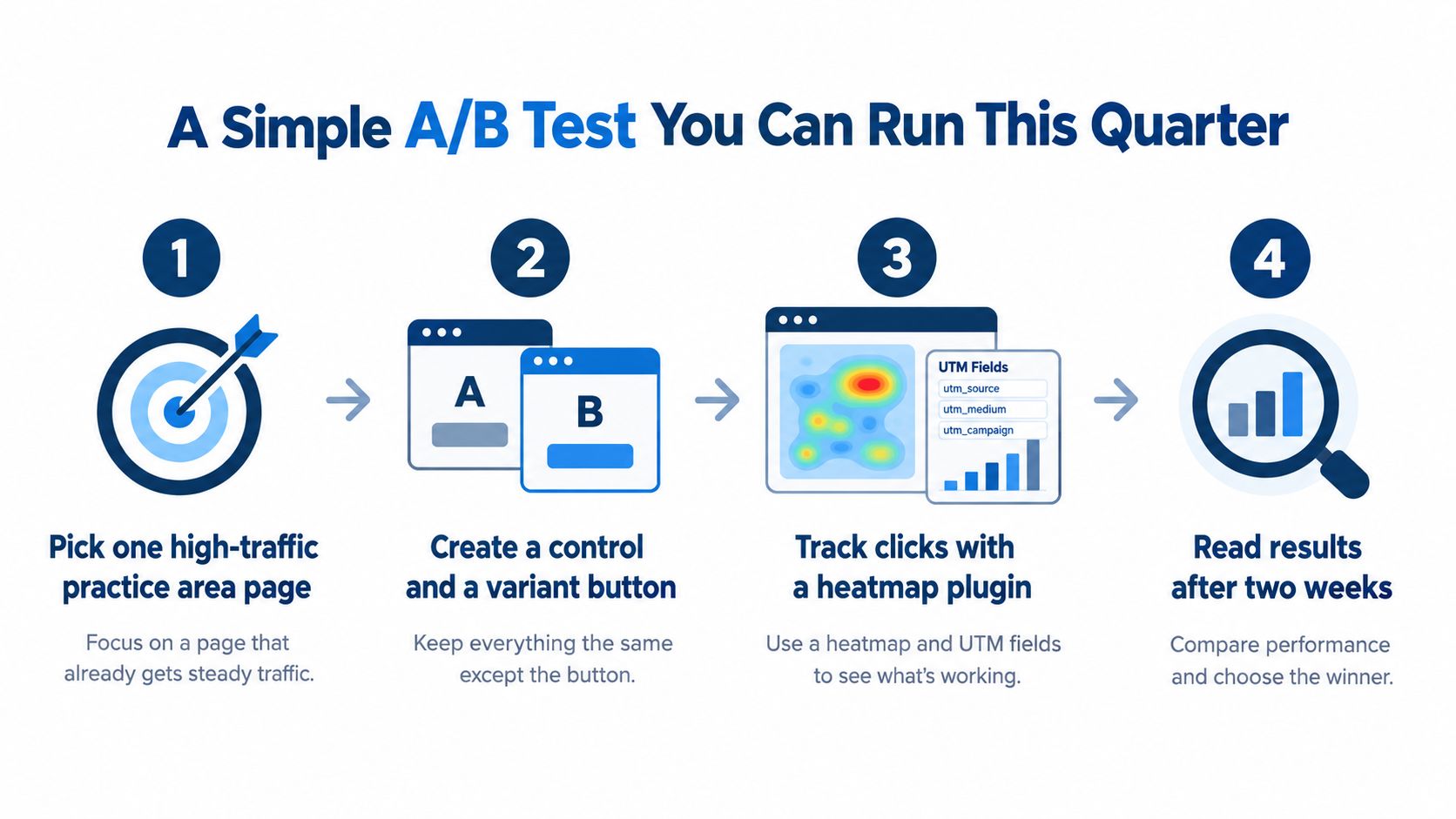
Run one focused test on one high-traffic practice area page. Use “Learn More” as the control and a specific action label as the challenger, such as “Get Your Case Reviewed.” Keep the offer, page layout, audience, and destination consistent. The test should run for at least two weeks or 1,000 sessions per variant, whichever takes longer.
A practical setup can use the CMS, a heatmap plugin, analytics, and UTM fields in the intake form. Teams interested in broader testing principles can review AI-driven conversion rate optimization for additional ideas, then keep the legal intake test narrow enough to interpret.
Measure the matter, not just the click
Track the full path:
- Clickthrough rate: How many visitors clicked each button.
- Scroll depth: Whether visitors reached the form or consultation block.
- Form-start rate: Whether the destination persuaded visitors to begin.
- Form-completion rate: Whether they completed the action.
- Qualified leads: How many inquiries passed to case managers within 48 hours.
- Traffic source: Whether paid, organic, referral, and direct visitors behave differently.
A click is an interaction, not a signed case. A button can increase clicks while producing weaker inquiries, more incomplete forms, or more administrative work for the intake team. Treating CTR as the only success metric is how firms end up congratulating themselves for making the website busier.
For a deeper legal-specific framework, see conversion optimization for lawyers. Promote the challenger only if qualified lead volume rises by at least 10 percent, or if click volume rises while lead quality holds steady. Otherwise, keep testing the page, the offer, or the handoff. The button may not be the only problem.
Accessibility and UX Issues Most Firms Miss
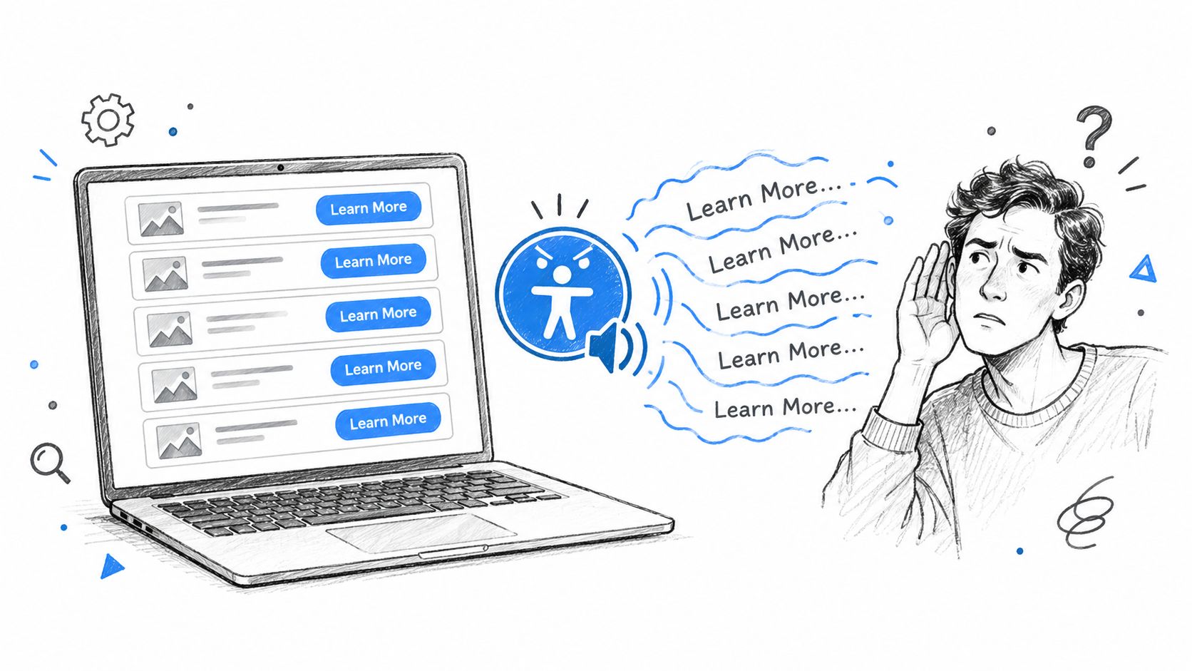
Repeated “Learn More” links create a serious navigation problem for screen-reader users. A sighted visitor may associate each button with the heading above it. A screen reader can announce a sequence such as “Learn More, link. Learn More, link. Learn More, link,” without preserving the visual relationship that supplies the missing context.
Accessibility guidance from Georgetown's link text recommendations specifically warns against generic phrases such as “Learn More” and recommends unique, descriptive link text. An independent UX article cited a small study with 56 participants, where only 28% clicked generic “Read More” buttons, reinforcing that vague wording can suppress interaction as well as reduce accessibility.
Make every action understandable alone
Use one of these fixes:
- Rewrite the visible label: “Learn More About Our Sacramento Car Accident Services.”
- Add visually hidden text: Keep a concise visible label, then add hidden text that identifies the destination for assistive technology.
- Use an accessible name: Apply an accurate
aria-labelwhen the visible design cannot accommodate descriptive wording, and verify that the accessible name matches the destination.
The first option is usually best because everyone receives the same information. The second and third require implementation review. An accessible name that says one thing while the visible button suggests another creates its own confusion.
Keyboard users also need a visible focus state. A button that changes color only on mouse hover is effectively hiding the current position from anyone navigating with a keyboard. Check focus visibility, semantic link or button behavior, and whether the element can be reached and activated without a pointer.
Color contrast matters too. Normal text should meet a 4.5:1 contrast ratio, and mobile tap targets should be at least 44 by 44 pixels. These are not decorative preferences. A prospective client who cannot identify, focus, or activate the button may never reach intake.
For the wider relationship between usable interfaces and firm growth, review legal client experience improvements. Accessibility is intake protection. It keeps the site usable for people who don't interact with it in the way the designer happened to test.
Turning Button Clicks Into Signed Cases
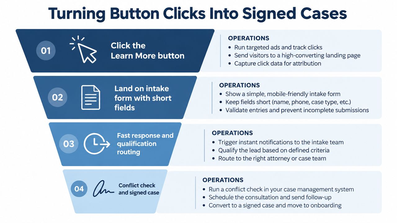
A button only starts the operational chain. After the click, the visitor encounters the form, response process, qualification rules, conflict check, and retainer workflow. If one link fails, sharper copy merely sends more opportunities into the same hole.
A useful intake map asks four questions:
- Is the form proportionate? Collect what the team needs to route and evaluate the inquiry, not every detail that might someday be useful.
- Who receives the inquiry? Route by practice area, geography, matter type, and availability.
- How quickly does someone respond? A form submission sitting unassigned in a CRM is not a follow-up process.
- What happens after qualification? The intake team should know when to schedule, warm-transfer, request information, or move toward a retainer.
A law firm can receive more clicks and still lose money if the first response arrives after the prospect has moved on. A button promising “Get Your Case Reviewed” must lead to an intake experience capable of reviewing the case, not an inbox where the request waits for someone to remember it.
Use a short operational checklist
- CRM tagging: Record the practice area, source, campaign, button variant, and intake status.
- Speed-to-lead: Set an internal response standard and audit whether staff meet it.
- Qualification script: Ask the question that determines fit before the first call ends.
- Conflict checks: Make the handoff explicit so a qualified lead doesn't stall between intake and review.
- Follow-up ownership: Assign every incomplete or undecided inquiry to a person, queue, or structured workflow.
Firms that need help with the follow-up layer can use a documented lead follow-up system rather than relying on memory and scattered notes. If your intake process lives primarily inside someone's memory, you've built the world's least reliable CRM.
Choose one practice area page. Replace one generic button, instrument the click through intake, and review qualified inquiries, signed retainers, and lead quality after 30 days. Attorney Assistant provides dedicated legal support staff through Staffline and 24/7 live intake through Frontline, including qualification and structured follow-up. Visit Attorney Assistant to evaluate whether your firm needs better button copy, stronger intake coverage, or both.
Related Articles
Medical Records Request: A Practical Guide for Law Firms
Run a clean medical records request with HIPAA-compliant steps, sample language, timelines, fees, and follow-up tactics built for law firm operations.
Request for Discovery Template: A Practical Guide
Use our request for discovery template with annotated fields, jurisdictional notes, and filing instructions. Customize it for federal or state court cases.
Litigation Support Services: What Law Firms Need to Know
Discover how litigation support services streamline discovery, reduce costs, and improve case outcomes. Learn what to look for in a provider.